StoreApp | Redesigning an Amazon Associate Experience
As a senior design consultant for the Amazon Campus program my goal was to build systems that increased efficiency, while making the work day of an associate less frustrating. I believed (and advocated) that well-designed systems for Amazon associates would ultimately empower them to improve our customer's experience. The Campus program was Amazon's first foray into brick and mortar locations, offering the team huge opportunity and challenge. Amazon pick up points straddle a unique combination - fulfillment centers that need to work efficiently for our associates and customer facing locations that represent the Amazon brand. This project showcases the systems I redesigned for Amazon associates who work in our pick up points.
Business Opportunity
The team was launching a new program and product called ‘Instant Pickup.’ This meant that stores would act as more than just locker bays, but would also need to operate like small fulfillment centers so that customers could instantly purchase items from Amazon while they were picking up their deliveries. This was before ‘just walk out technology’ and the brick and mortar Amazon bookstore, so Amazon hadn’t tried a true in-person shopping experience before. In order to support the launch of Instant Pickup, Store App (the application associates use to pick and pack orders) needed to be redesigned to accommodate products instead of just packages. The team wanted to increase the amount of products and packages pushed through the location without building a new back of house tool, and without adding labor cost.
Solution
After auditing the use cases and shadowing associates at existing pickup points, I implemented changes in the hierarchy across the StoreApp tool to better reflect customer need and intent. I emphasized consistency in UI text and UI patterns, and developed a StoreApp style guide so developers and product managers could work on small changes in the future without design support. I developed a new "mode" of the tool to support Instant Pickup functionality. The updated product launched with Instant Pickup, and Amazon Pick Up points didn’t need to add any additional staff to brick and mortar locations to support the new product.
My Role
I was the lead UX designer on this project, working as an individual contributor. I designed and carried out all the research studies, formulated the design strategy, developed the new information architecture, created wireflows and maps, and designed the final screens for delivery to the engineering teams.
Detailed Case Study
Background
The Amazon Campus Team, a sub-team of the Textbooks Team, had started a new initiative to respond to overwhelmed university mail rooms. Campus was putting brick and mortar Amazon locations on universities, where students could pick up the textbooks they had ordered on Amazon, as well as pickup other Amazon deliveries. Much like the Amazon Lockers that are present in multiple city locations, Amazon Pickup locations were an in-person experience with lockers and Amazon associates.
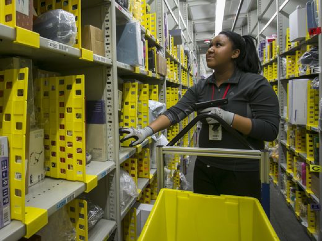
StoreApp is the program Amazon associates use in pickup locations to pick, sort, pack, and deliver packages. Based on conversations and interviews with our associates, I knew we needed a solution that prioritized their workflow and made their job easier.
Our Customer
The product team wanted someone to jump into designing a solution right away - they felt that research wasn’t needed, and time would be better spent focused on solutions for our customers (the person who gets the box) rather than employees. I was able to convince the team that some research would be advantageous, and I spent time in the stores following associates during their work day before jumping into design solutions. One thing I learned right away is that though we assumed our associate audience were ‘super users’ who would be able to just find a workaround for frustrating technology, that wasn’t always the case. Our users were often new and had to learn the product while they were doing their job, many of them were working in a second or third language, and/or experience their first job ever. We needed to design a tool that anyone could pick up and start using to do their job, no matter what prior experience they had. In addition, our use case was unique for Amazon - not only were these associates moving boxes around in the back of house, they were also customer facing. Often customers would come up to the front desk while an associate was completing a task, causing them to loose track of the task they were trying to complete. Associates are constantly on the move, and, because Amazon staffs pickup points as lightly as possible, associates could be interrupted by customers at any point.
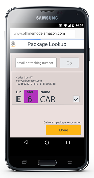
The original design was only for specific packages, and contained a lot of similar information on the same page.
Design Goals
I was able to buy myself research time by convincing the product teams that by designing this solution the right way, they would likely not have to invest in UX support for this product in the future. Prior to my work, there was little documentation of StoreApp. No site maps, redlines or process flows to be seen. The product team was using design time to re-learn how the product worked every time they needed to make an update, which was not only inefficient, but created inconsistencies across the existing product. My goal was not only to design for the new use cases created by Instant Pickup, but to develop design specifications and guidelines that could be used in the future, so the team could move more quickly on improvements.
Solution
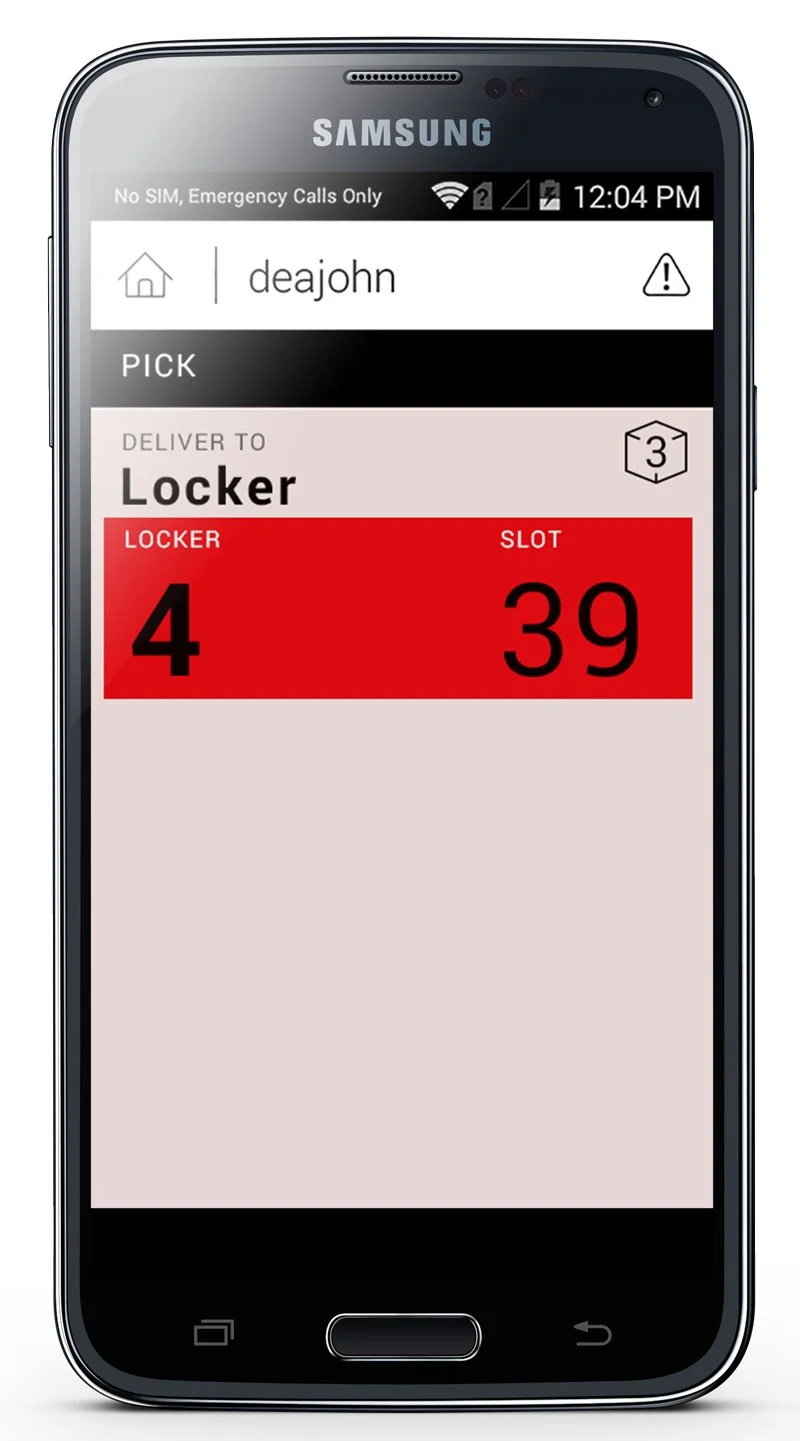
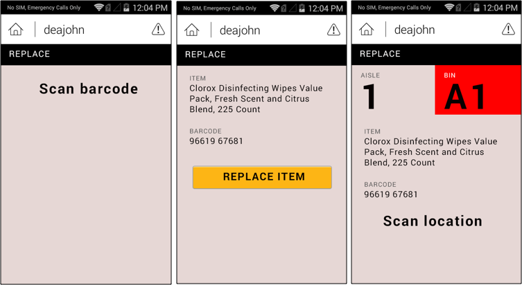
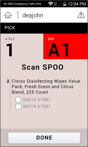
Because there was no documentation of the existing products, finding use cases, error states and edge cases took time. I documented as I went, and worked closely with the engineering team to understand how the system worked. Because we were adding products to the workflow, where we had previously only had packages with unique barcodes, we needed to not only change the app, but change the design of the pickup location. I worked with designers in other parts of the business who worked in fulfillment centers to understand best practices for how stores were set up. For example, items that only have small differences (crunchy vs. puffy Cheetos) should be in different parts of the back of house, so they aren’t inadvertently mixed up. I also worked on defining the hierarchy of the pages, so locations, quantity of items and directions were easy to spot. Understanding how often associates were interrupted caused me to design more screens than I normally would have - every time an action was needed the screen state changed, so an associate could always pick up where they left off with a clear call to action.
I developed medium fidelity wireframes from the existing StoreApp screens to communicate the new flows and patterns to the development team. Time to develop the changes to this product was severely limited, I sat with the engineering team so we could go straight to developing screens, rather than designing each one. We worked closely together to understand Android development best practices (totally new to me), when to use Android standard UI elements, and for what use cases developers needed redlines in.