Amazon Pickup: Redesigning the In Person Experience
As the senior designer for the Amazon Campus Team, a sub-team of the Amazon Textbooks Group, I was tasked with improving the customer experience at Amazon's first brick and mortar stores. My work focused on integrating our online and in-store services into one cohesive customer experience. I designed several products for the Campus team during my time there; including Amazon's fastest order to delivery service: Instant Pickup.
Customer Problem
Anecdotal evidence and usability testing showed that the pickup experience, especially for first time users, was confusing - customers didn't know what to do or what to expect when they arrived at the location to pickup their stuff. After conducting an audit on the experience, I had further concerns about the usability and accessibility of the service.
Business Opportunity
Aside from the business case for reducing confusion for customers, I hoped to design an experience that would allow customers to self-serve within the pickup location. This would reduce time spent on the task of picking up packages, allow for more customers to organically interact with the Instant Pickup feature, and reduce the need for multiple Amazon associates in the location.
Solution
I designed a more streamlined pick up process that reduced the number of steps the customer took, increased the clarity of the process and reduced the amount of reading necessary to be confident in the outcome of the process. These results were confirmed by qualitative usability data (customers reported a confidence score of 8.5 - 9 (out of 10) for each major change in the UI. The improvements were further confirmed post launch. 84.5% of pickups went through the lockers (rather than through an associate), an increase of 10.2% (1772 out of 2075 pickups).
My Role
I was the lead UX designer on this project, working as an individual contributor. I designed and carried out all the research studies, formulated the design strategy, developed the new information architecture, created wireflows and maps, and designed the final screens for delivery to the engineering teams.
Detailed Case Study
In addition to a UI audit, I also conducted a content audit of all the screens a customer would encounter during the pickup experience.
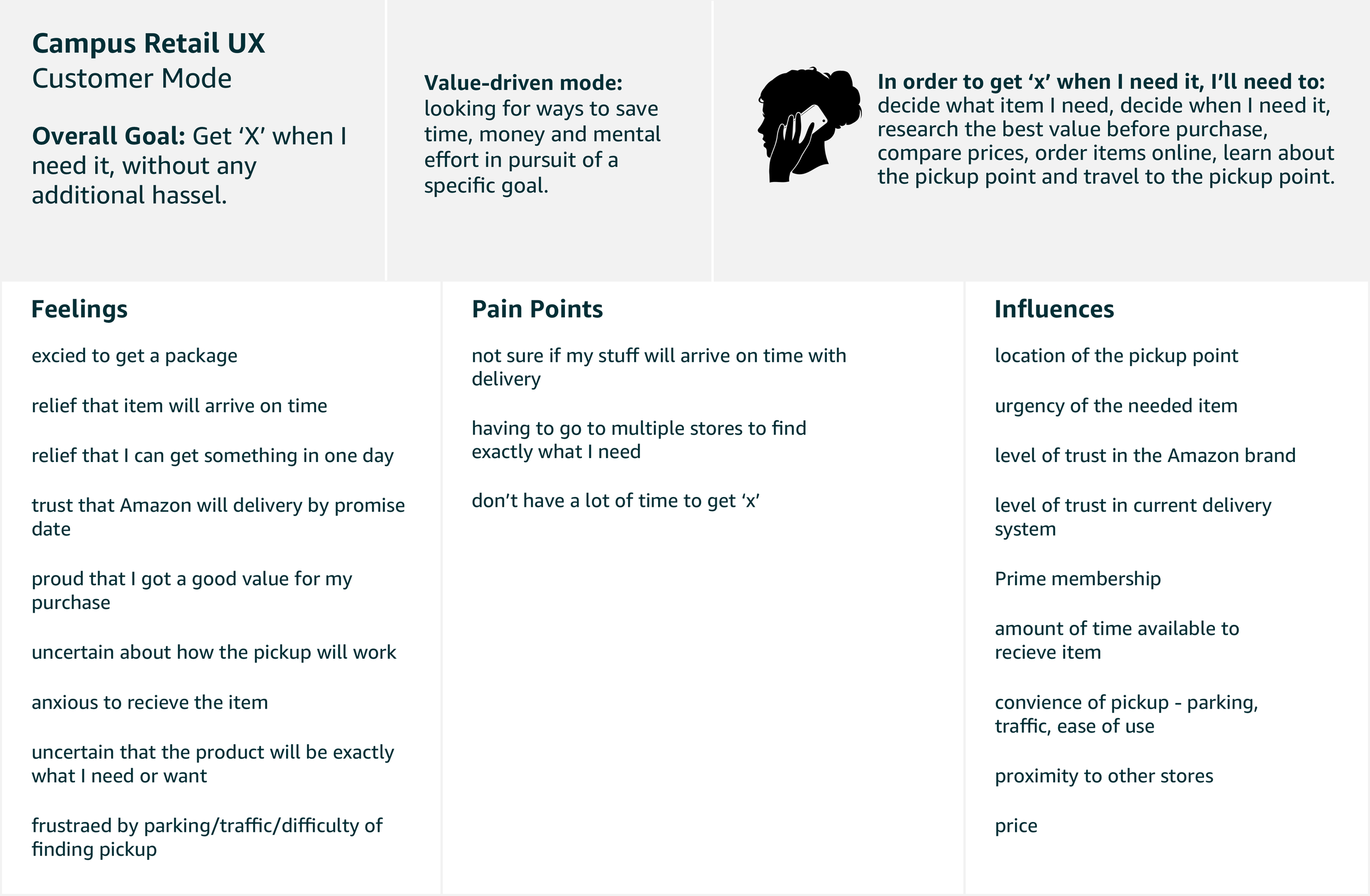
I introduced the team to the idea of customer ‘‘modes’ rather than using personas as part of this project. Using this mental mode, the team was able to quickly understand how to think about designing for a customer in this situation - it helped the team frame why a person might choose pick up, what mental state they would be in as they tried to navigate our system, and what external barriers they might have to success.
Background
The Amazon Campus Team, a sub-team of the Textbooks Team had started a new initiative to respond to overwhelmed university mail rooms. Campus was putting brick and mortar Amazon locations on universities, where students could pick up the textbooks they had ordered on Amazon, as well as pickup other Amazon deliveries. Much like the Amazon Lockers that are present in multiple city locations, Amazon Pickup locations were an in-person experience with lockers and Amazon associates.
Before I started in role, the product team had worked with researchers from IDEO, who proposed the team explore enabling not only package delivery at the sites, but also provide students with the option to purchase convenience items from Amazon, instantly. The team was excited about how this new initiative may lead to 4-wall profitability, but were concerned that the existing experience wouldn’t support this type of shopping experience.
I was hired on as a consultant to pick up where IDEO had left off, turning their research insights into a design strategy and final product.
The Problem
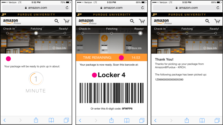
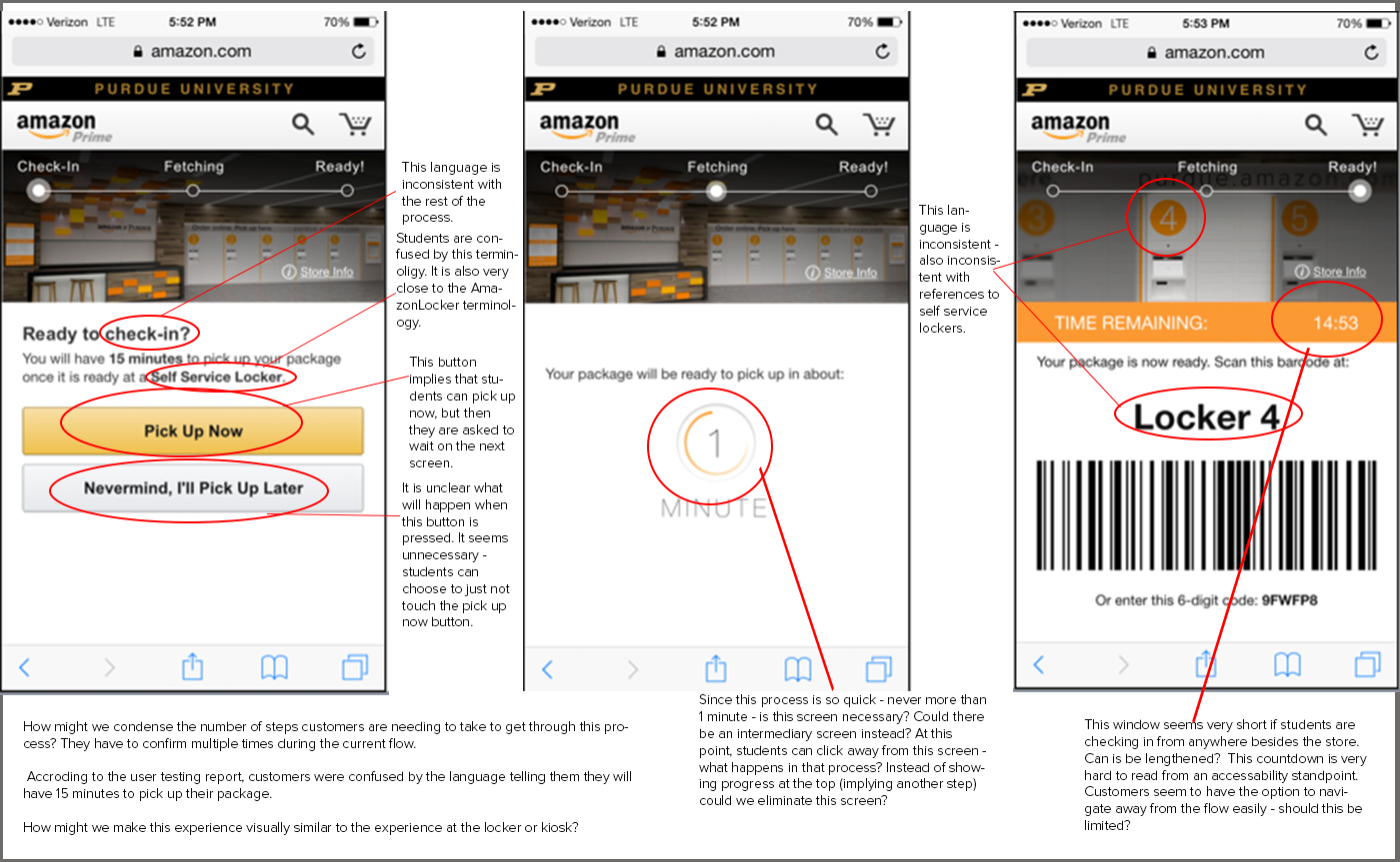
I started with an audit of the existing experience, and found multiple issues that were likely causing customer confusion. In addition to auditing the UI for best practices, I also conducted usability studies on the existing experience with customers on college campuses. This project was interesting because users started their journey on the Amazon site - after they made a purchase, they were presented with an option to pick up their items from an in-person pickup point near them. A day or so later, they were notified that their package was ready, but they were taken to a completely new UI to complete their pickup. This new UI was confusing, and the steps it led them through didn’t make sense in the context of actually picking something up for the first time. I collated all of the usability issues into a report for the team. A few of the examples I presented back to the team included:
1. Content Issues: Customers were presented with a wall of text they probably didn’t read, the call to action wasn’t clear, and especially wasn’t clear when viewing this experience on a mobile device, the information hierarchy of the page presented usability issues.
2. Unclear Workflows: The ‘happy path’ for customers wasn’t clear. There were multiple opportunities where customers were asked to choose between two "unknown options," the microcopy was unclear and didn’t indicate what would happen next.
3. Meaningless Elements: There were multiple meaningless elements on the page, including a progress bar that didn’t add value, and a countdown timer than caused anxiety.
Design Goals
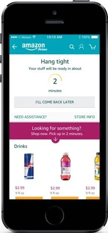
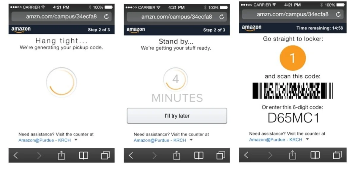
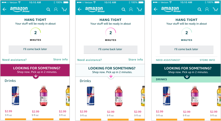
The eventual goal was to design an experience that would allow customers to browse items available for instant pickup while they waited for the packages to be ready in a locker. Unlike Amazon Lockers, at peak times on campus, pickup points had to act like mini-fulfillment centers. There were too many packages to be picked up to have lockers full at all times, so a customer needed to let the store know they were on their way, and an associate needed to get their package, put it in a locker, and then the system had to tell the customer what locker it was in. While customers waited for this to happen, they would be able to browse items (like bottled soda, snacks, fun things they may have forgotten they needed) and add them to their order. In the current state, customers were so confused that browsing for additional items was highly unlikely.
I landed on two main goals for a redesign of the experience:
1. Reduce cognitive load by removing unnecessary steps and clearly communicating customer actions
2. Increase accessibility for customers who used assistive technology
Solution
My proposed redesign reduced the number of screens from 6 to 4, and removed the number of steps and unnecessary choices presented to the customer. I removed features like the 'count down timer,' a factor that customers reported was stressful. I reorganized the information architecture, prioritizing action items for the customer. I also moved the accessibility call-out to the bottom of the page, where it was easier to see (rather than hiding on the header image).
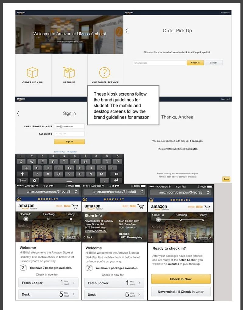
I tested the above wireframes with customers in the context of the pickup locations, I wanted to make sure the basic workflow was easy to use before we added our new feature, Instant Pickup. One important thing I learned from the initial usability study was that the transition from the look and feel of the Amazon checkout experience to a different look and feel on the pickup experience was confusing to customers. After I established that the newly designed flow made sense, I started exploring our pickup experience in Amazon’s brand colors (below). The pickup experience and redesigned pickup flow launched following Amazons brand guidelines and created a more cohesive visual experience for customers.
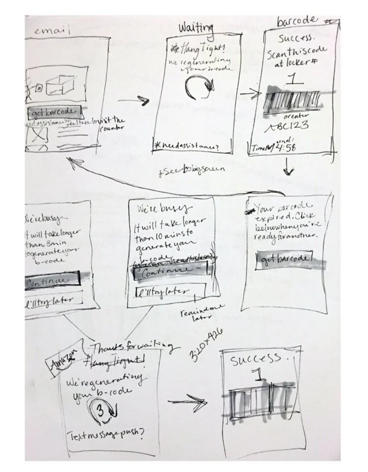
Initially, I started thinking through alternative flows using very lo-fidelity mocks as a tool. Working in lo - fi allows me to iterate quickly, get input early and often from stakeholders, and allows for stakeholders to participate in the design process without being intimidated by visual design.
Learnings
I designed a more streamlined pick up process that reduced the number of steps the customer took, increased the clarity of the process and reduced the amount of reading necessary to be confident in the outcome of the process. These results were confirmed by qualitative usability data (customers reported a confidence score of 8.5 - 9 (out of 10) for each major change in the UI. The improvements were further confirmed post launch. 84.5% of pickups went through the lockers (rather than through an associate), an increase of 10.2% (1772 out of 2075 pickups). The goals I had set out to improve the pickup experience had been achieved. However, we learned that customers didn’t really want Instant Pickup from these pickup points, at least not at the scale we needed to make these pickup points profitable.
What I did learn during several research studies was that the pickup points were incredibly useful to customers as place to return Amazon items. Multiple customers mentioned the ease and simplicity of returns in an Amazon location. Before I left the team, I provided a research report on the possibility of exploring customer needs around return stations - potentially embedding instant pickup with a return workflow, and making the returns process even easier.
The existing experience. The pick dots represent areas that I called out in my audit.
