Stencil: A Design System for Amazon Employees
As the head of UX Research and Design for Amazon’s Global Talent Management Organization, I lead my team to advocate for, design, and build Amazon’s design system for employee experiences, Stencil.
Stencil enables product teams to attract, grow, and retain the best talent by driving consistent, accessible, bar-raising experiences across the employee journey — from a potential candidate, to a new hire, to a tenured employee. It does this by being the design system for HR - an inclusive and enterprise-grade design and development framework which shapes the employee experience of 1,000,000+ Amazonians - helping Amazon attract and retain the best talent in the world.
The Problem(s)
When I joined the Global Talent Management team, my team uncovered three key problems in the journey across internal employee experiences 1) experiences didn’t meet basic accessibility guidelines, and there was no benchmark or consideration for more general inclusive experiences 2) experiences were inconsistent, forcing users to learn new patterns with each new internal product they needed to use 3) design and engineering teams were not working as efficiently as they could be, creating new design patterns and components for each feature and product.
The Outcome
We released Stencil, a design system and React component library to meet or exceed WCAG 2.1 AA standards ‘out of the box,’ and Stencil became the internal gold standard of accessible development. 2 years after it’s initial release, 30 internal products were using the Stencil design system, and the HR organization had taken a goal to ensure all new products were built using the system. Designers and engineers using Stencil reported time savings of 50% on average, this was estimated to be a cost saving of $500,000 per team.
My Role
Stencil was the first project I pitched after taking the head of UX role for Amazon’s Global Talent Management Organization. As part of my first 90 days, I asked my team to audit both the experiences we were responsible for, as well as the experiences designed by adjacent teams that made up our larger customer journey. As my team synthesized the audit, creating a robust, accessible design system became a priority. My role became a strategic leader for the program, executive sponsor and advocate for funding the program, and creative director for the design system.
Detailed Case Study

I asked my team to audit our products and start documenting inconsistencies. As the project evolved, we continued to audit for various types of inconsistencies experienced across the HR journey.
Background
I relocated to Edinburgh, Scotland at the beginning of 2018 to build out a design and research team that would support Amazon’s Global Talent Management organization. When I started in the role, there was a small team of 4 designers, who had been hired by the engineering leader and were working on designing about 4 products that supported a few HR initiatives. The team was rapidly building new HR products to support Amazon’s expanding businesses. The team who hired me wasn’t sure what they needed from a design team (or a design leader for that matter), but were hoping having UX designers on board could help their engineers make fast progress against aggressive business goals.
In order to better understand the state of the products I had inherited, I asked my team to audit our existing products, new products they had designed that weren’t built yet, and products that weren’t owned by our team but that our customers (Amazon employees) used as part of their ‘HR journey.’ I also dug into any existing research my team or adjacent teams had done to inform our audit and plan for the next year.
The Problem
We summarized the results of our audit into three parts:
Our products weren’t meeting the bar for diversity and inclusion. Across the core HR journey, most products had some form of usage-blocking accessibility defect. This meant that there were candidates who couldn’t apply to Amazon, and there were Amazonians who are unable to follow mandatory HR processes without taking their work outside of product.
The HR product experience was disjointed. We found that a new-to-Amazon manager would encounter at least 10 different visual styles and written content from 12 different verbal style guides when interacting with the core HR experiences required for their jobs. These inconsistencies included visual design, copy, and functionality between different products. The scale of the difference an Amazonian would see ranged from a distinct visual style (i.e. different color palettes, typography guidelines, and interaction design) to more subtle inconsistencies (i.e., different typography sizes, line heights, and button dimensions). These unnecessary inconsistencies not only caused frustration for users but also represented redundant design and engineering work, as the same problems were being addressed repeatedly, inhibiting us from scaling quickly and preventing developers from focusing on bar-raising user experiences.
Our design and development process was inefficient. Teams were creating new design patterns and components for each feature and product they released. Further, there were no front end engineers in the HR organization, so developers who focused on back end systems were creating and re-creating interaction patterns for every new product.
The Solution
The audit uncovered obvious gaps both in the customer experience and the way we were working. Though I had never built a design system from scratch, it seemed the obvious solution to many of the problems we’d uncovered. My team spent time investigating other design systems we could use, rather than building our own, and came up short. Other internal systems either didn’t meet our accessibility goals, or wouldn’t be able to support the rapidly growing HR use cases. I pitched the idea of the design system to my leadership team, and, after various attempts, secured a small amount of headcount dedicated to building it.
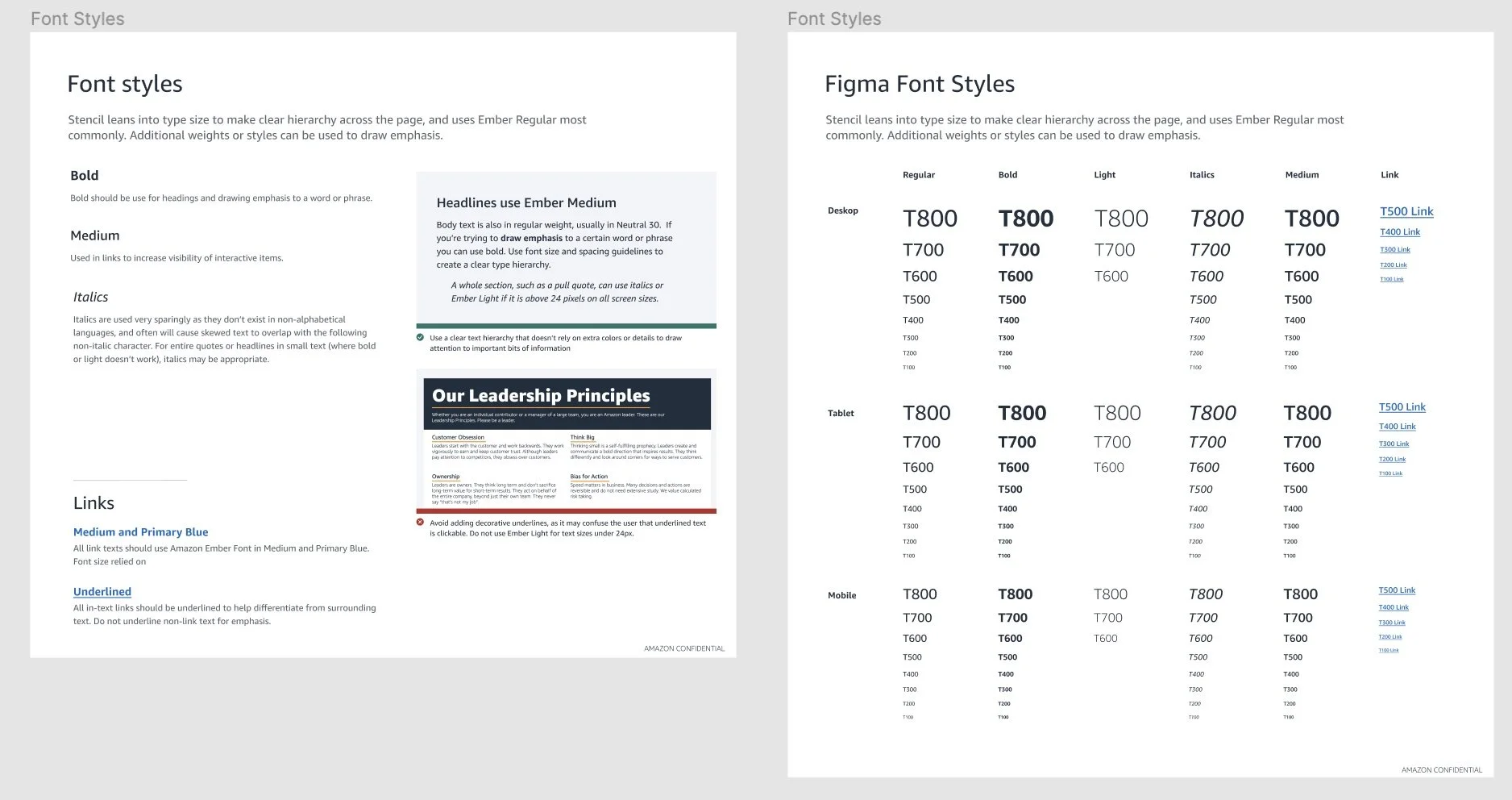
Within the first three months the design team had created four fundamental components (color, spacing, typography, and iconography) that together combined into 22 larger components, such as buttons, tabs, and forms. All of the components could be assembled to create larger UI patterns and experiences without reinventing the wheel.
By 2020, when I moved on from owning the Stencil program, Stencil had grown to be the system as a whole which designers, developers and content authors consult if they are working on HR systems. The design system includes the Stencil React UI library and the HR Style Guide. The Stencil React UI library is the set of building blocks which customers use to create product experiences that follow the Stencil Design System. The HR style guide is the set of guidelines which help customers to create experiences, content and communications that embody the HR style, whether they are using the UI library or not. We had moved adoption from 7 products at the beginning of 2019 to 30 products in 2020. By 2020, the team built 50 components - all are accessible and responsive. We created a website with style guidelines, which has 287 monthly active users. We created a long-term support plan, browser support plan and a contribution model. We released a style guide which we produced through a working group of representatives from across internal Amazon teams. This includes a color palette that aligns with the Amazon Brand, a unified verbal style guide and more comprehensive design guidelines. We evolved our working model to accept contributions from teams using the system, and had more than 500 unique individuals actively contributing to the system in 2020.
Over time, we developed a full Figma library for the system, complete with design guidelines for every atom, component and pattern.

Learning 2 | Design system does not equal front end expertise. From the outset, I was determined that Stencil would be accessible ‘out of the box.’ Every component we released would meet WCAG 2.1 AA standards, and therefore (I thought) products that implemented Stencil would be accessible. After about 6 months of having a React version of Stencil in product, I hired an accessibility consultant to reassess the accessibility of those products using it. To my dismay, using Stencil had fixed only about 50% of critical accessibility issues in products. I learned that though Stencil components were accessible, an engineer could still make decisions about how to use those components that lead to inaccessible product experiences. The engineering teams in HR didn’t specialize in front end engineering, and we uncovered that basic best practices were not being followed (e.g. heading structure, ARIA labels). In order to move the needle on accessibility I did three things:
1) I taught the organization about the importance of accessibility. It wasn’t enough that the design team cared, the entire organization needed to become advocates. I ran usability testing with customers who used assistive technology and shared those sessions with leadership. I conducted accessibility labs where team members (including our executive team) could use our products with assistive technology. I got trained to teach accessibility basics for designers and hosted sessions for the HR organization.
2) I worked with engineering leaders to start hiring front end engineers to their teams. When I started in this role, there were no FEEs in the HR organization. When I left the role in 2020, Stencil had a dedicated team of FEEs, and every product team had at least one FEE embedded in the team.
3) I built an accessibility program as part of the larger Stencil organization. The accessibility program had a dedicated program manager responsible for curating and developing curriculum for accessible design and engineering, auditing products for accessibility, training accessibility subject matter experts who would embed in teams, and auditing and reporting on accessibility issues in products. Our team proposed a cross HR goal to make every product ‘born accessible,’ and every legacy product had to have a remediation plan to fix accessibility issues by 2021.
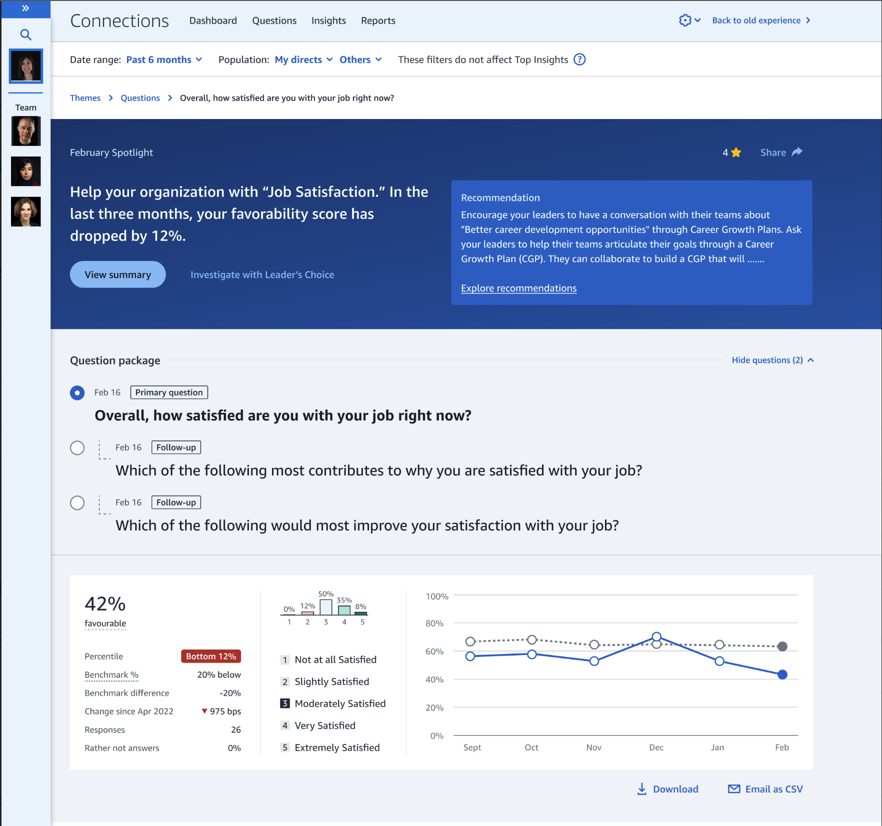
Stencil has now been a product for 6 years, and it continues to grow and evolve. The screenshot on the right shows how Stencil’s style has grown to incorporate data visualization elements, an updated color scheme and slightly different visual style. Before I left the team in 2020, using Stencil to build HR products was mandatory, and the team had expanded to not only include the style guide and react library, but the accessibility program, localization program for internal products, as well as a research repository with personas and customer journey maps. In 2020, 30 internal products were using the Stencil design system. Designers and engineers using Stencil reported time savings of on average 50%, this was estimated to be a cost saving of $500,000 per team. Most importantly to me, accessibility had become a top priority for the HR organization as a whole - with an org-wide initiative to launch products that were born accessible. The Stencil accessibility program was no longer as important, because product and engineering teams replicated the program and embedded accessibility into their development processes.
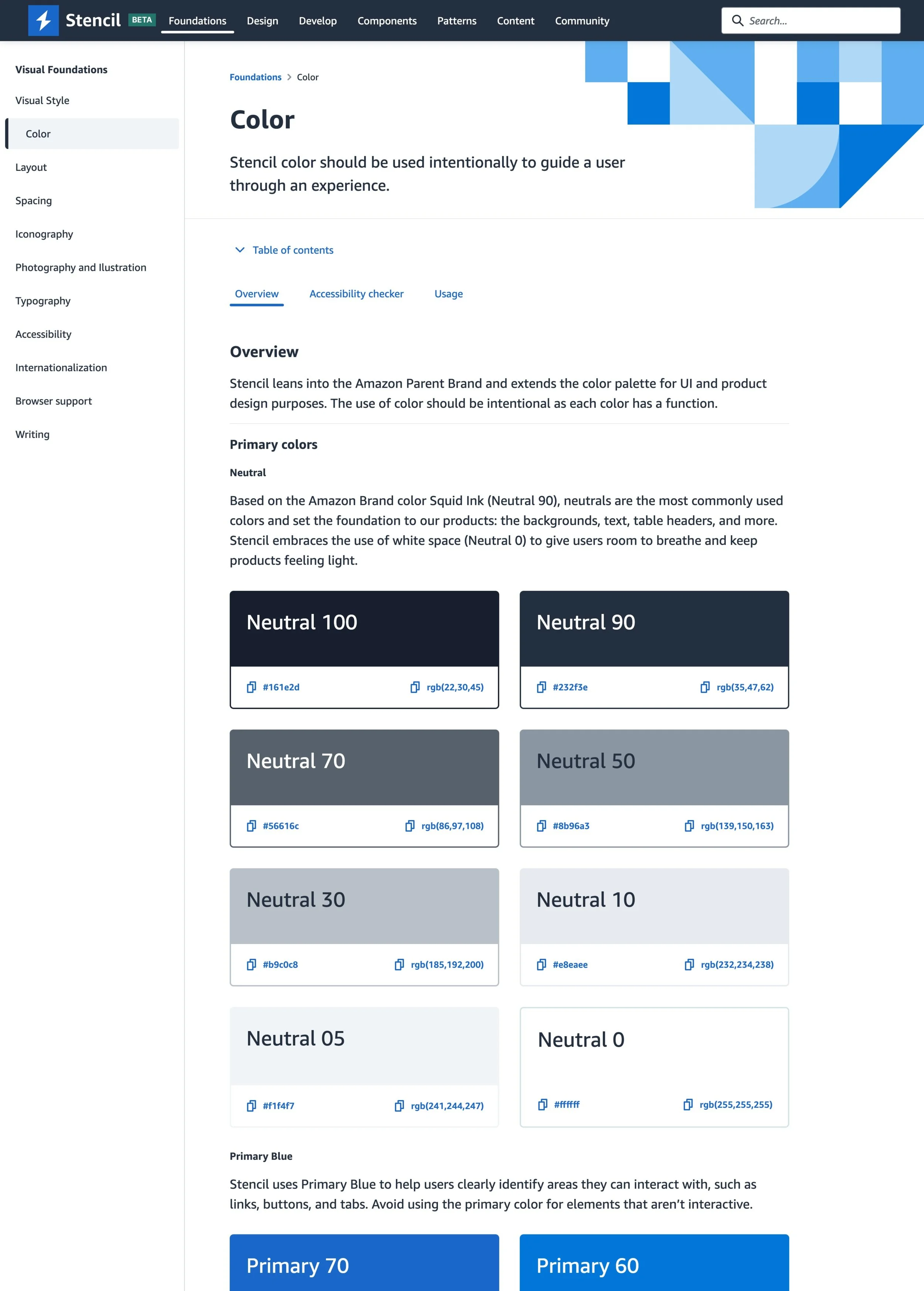
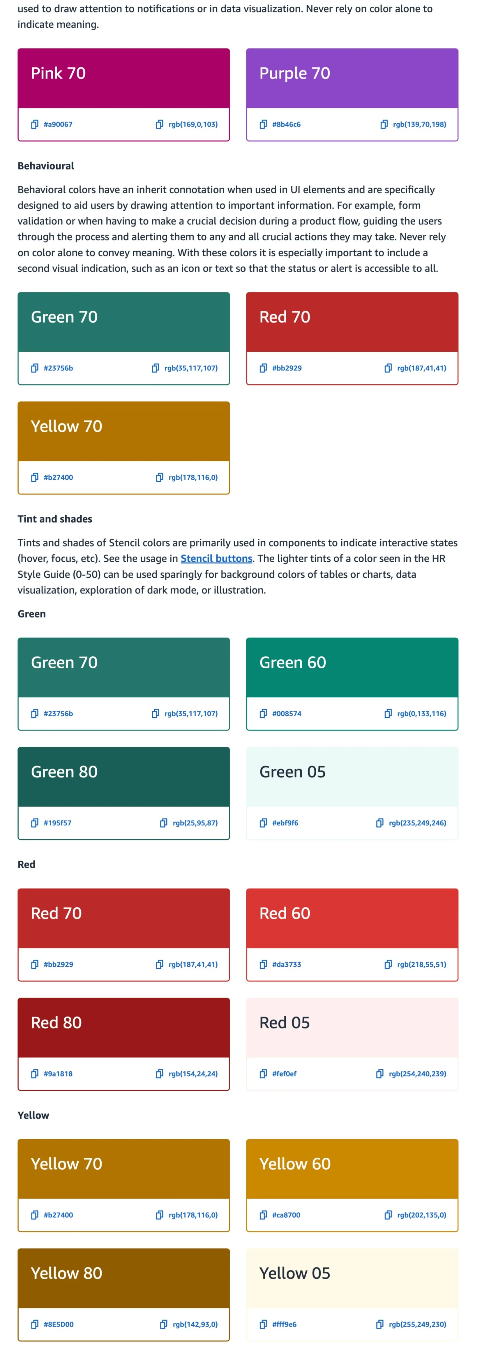
Defining the Stencil color palette was especially challenging. We landed on a blue theme based on multiple rounds of usability testing, consultation with Amazon’s brand team, and multiple stakeholder sessions. The biggest sticking point was how to use Amazon’s token orange color (many wanted to use it as the base for the system). We were able to convince stakeholders that smile orange should only be used as an accent in some contexts, due to accessibility and usability considerations.
Learnings
Learning 1 | You can grow too fast, too soon. When my team took on building this design system, our scope was intended to be the design system for talent management products. In short, we were building it for us. We were growing quickly, we needed consistency, and there wasn’t a system out there that met our needs. It became obvious that designers and engineers in the HR organization as a whole were clamoring for a design system. Without any real effort to evangelize the system on our part, within three months of declaring we’d build it, there were five products using Stencil components in production with seven more products planning to use the system for new features, outside of our organization. Suddenly, our scope changed from ‘our design system,’ to the design system for Amazon’s HR organization. This organization supports hundreds of products, across all business lines and employee types (folks who work in fulfillment centers, driving delivery trucks, working in labs, engineers….the list goes on). People were adopting our system and we were barely out of the gate. The problem was, we really weren’t ready for the system to be used outside of our team. We initially started building it for use cases that we understood, for products we supported. This created some issues we weren’t ready to support:
1. Teams were adopting it who built products for all kinds of HR use cases, that we didn’t understand at all and it wasn’t working for those use cases (yikes) and 2. Teams were adopting and using components faster than we could write usage guidelines (stressful).
At the point we realized how many teams had taken dependencies on our tiny, not-well supported system, we were too far down the road to ask them to wait. I knew we needed to keep building , but we also couldn’t ignore the very real concerns about the long term viability of the system. I set up multiple listening sessions with those customers using our system to understand their biggest needs and concerns and used this data to lobby for dedicated engineering support for the system, hired a software development manager to run the newly formed engineering team, developed a ‘Stencil Council’ so prioritization decisions were made by all the teams who needed the system, and hired a dedicated visual designer to form a cross-HR working group to steer the creative direction of the system.
Not only did we need our partners to understand accessibility, we needed our product, engineering, partners to understand and embrace that accessibility was their responsibility. Eventually, the Stencil documentation site became a valuable resource for learning about accessible design and development.
Learning 3 | The trap of the contribution model. Though Stencil eventually got traction and became one of my ‘legacy’ contributions to my role at Amazon, getting it off the ground took two years of convincing leadership to fund it. During one of those moments when funding was scarce and unlikely, the team started down the road of ‘open sourcing’ Stencil to the community of folks who were using it. This seemed like a fantastic idea - all those people who needed it could help us design and build it. We very quickly understood this was not as easy as it seemed. We opened our doors to contributions, and the contributions we got, we couldn’t use. Submitted components didn’t meet accessibility guidelines, design documentation on contributed components was poorly written (or didn’t exist). We spent time building programs that would help make contributions better, then realized that all our design and engineering time went to policing our programs, rather than building the system.
Getting enough resources to build everything the HR organization needed was not going to happen, so I developed a better system for contribution. By speaking with customers using the system, I learned that our users wanted improved collaboration, contribution processes, and communication. I hired a program manager to dedicate 50% of their time to a customer success program in order to improve satisfaction. They provided increased partnership mechanisms, including improved design collaboration via Figma, resources for new adopters and increased support for teams that had queries or difficulties when using Stencil. I pushed the team to think about Stencil like a business, rather than a system that partner teams had to adopt. This helped us scale support and customer understanding as we scaled the design system. We also invested in collaborative workshops that brought cross-product designers together to ensure components scaled. There were development workshops to help solve challenges which engineers encountered with component contributions and accessibility. We worked closely with design teams to foster a ‘Stencil-first’ approach during the design process. We awarded badges and published case studies for products which excelled in following Stencil guidelines. We created a Stencil Ambassadors program where representatives from across teams meet regularly to share how they are designing and building with Stencil and discuss contributions and ideas to move Stencil forward. We also invested in a cross-HR component audit to measure how much Stencil is used across products and fed those findings back into the roadmap. We redesigned the Stencil documentation website with improved usability and resources, as well as a more detailed Stencil roadmap, including contributions progress. Customers could more easily understand requirements, vote on priorities, and collaborate.